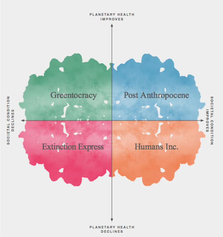
A quick glance at this graph (published by a London engineering firm) reveals what’s wrong with our world–but not in the way that the makers of the graph intended.
Note that the “social condition” and the “environmental condition” are placed on two axes–implying that they are disconnected, that you can have a change in one without the other changing.
It’s not clear from the graph what the creators meant by “societal condition”. If they meant the power to buy (largely unnecessary) consumer goods, then the graph is wrong, because “social condition” (i.e., buying power) could not increase without causing a decline in the environmental condition. While it is possible for a society to live in equilibrium with the natural world, the drive toward “economic growth” (i.e., increasing consumption) is fundamentally at odds with ecological health. Using this definition of “societal condition”, the societal condition and the environmental condition are inversely correlated–when one goes up, the other goes down.
If, on the other hand, what the graph’s creators meant by “societal condition” was physical/psychological/spiritual health, then the graph is still wrong, because it is impossible for the environmental condition to decline and the social condition improve. Using this definition of “societal condition”, the societal condition and the environmental condition are positively correlated–when one goes up, so does the other, and when one goes down, so does the other.
Either way, the graph makes a fundamental error in separating our social and environmental conditions, when the two are, in fact, inextricably intertwined. Our dominant cultural paradigm, however, assumes that human society and nature are somehow separate. This mental separation of culture from nature is used to justify the domination of humans over other species and the life-supporting Earth systems we call Gaia, as well as men’s domination over women, the domination of certain (usually fair skinned) ethnic groups over other (usually darker skinned) ethnic groups, and even the domination of our thinking selves over our feeling selves. The result is environmental degradation, patriarchy, racism, and psychological alienation.
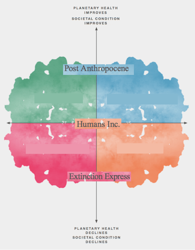
Here’s what the graph should look like:
Note: This explanation of the graph suggests that the creator’s definition of “societal condition” is not really precise, some mixture of political stability, access to social services, economic equality, civil liberty, and lack of market regulation–factors are themselves are not directly correlated or, in the case of market regulation, inversely correlated–so it’s no wonder the graph is a mess.

One thought on “This Graph (Unintentionally) Reveals What’s Wrong With Our Worldview”